Blippar App
UX Design, Prototyping
My role in the project was as a UX Designer in a team of 3 designers. Part of a roughly 30 people product team.
2016 · 3 months
For years Blippar's main source of revenue was through compelling augmented reality (AR) experiences for big clients. Instantly try the latest Max Factor range, play a game with the characters on your Kellogg's cereal box at breakfast — you get the point — all delivered through a single app.
These successful campaigns helped the company fund a bigger vision. A product with utility outside of these fun, somewhat gimmicky single-use experiences. To build a product that took advantage of their fancy AR and computer-vision technology.
The goal was to build a Google for the visual world. Connect people with information about the things they see through an AR app. Oh, and do it in 3 months...no biggie.
First principles
Our first steps as a design team was to consider what we already knew about interactions in AR through previous work. We created a set of principles that we knew would be important for a consistent user experience.
- Always be clear what the app is doing
- Progressively display information to avoid overload
- Allow for hand-off from AR to screen space for further exploration
- Optimise for short engagements
- Be visual where possible
Tech constraints
Our biggest constraints was the lack of a technology called SLAM (simultaneous location and mapping) which allows for overlaying information on an object based on where it is — a pretty important factor for AR.
SLAM is something now widely available thanks to frameworks built into our phones but at the time, the lack of it created considerable challenges. Many of our best ideas that went unused were ones that required SLAM to be effective.
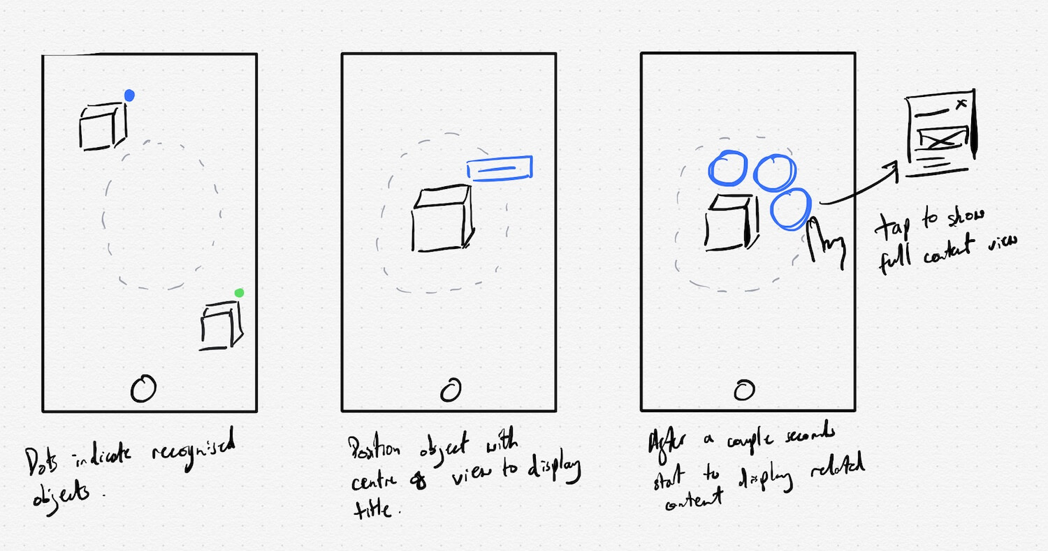
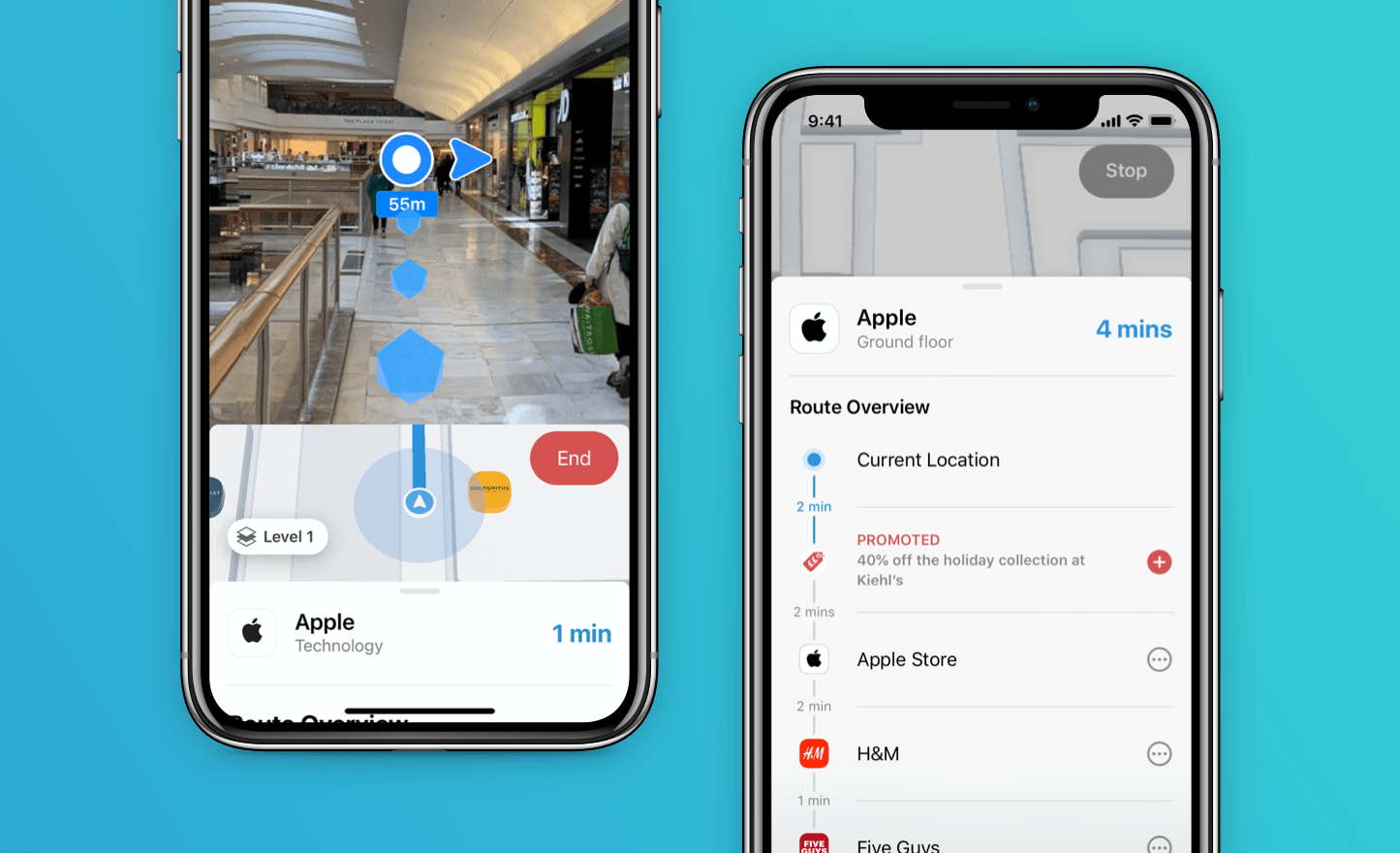
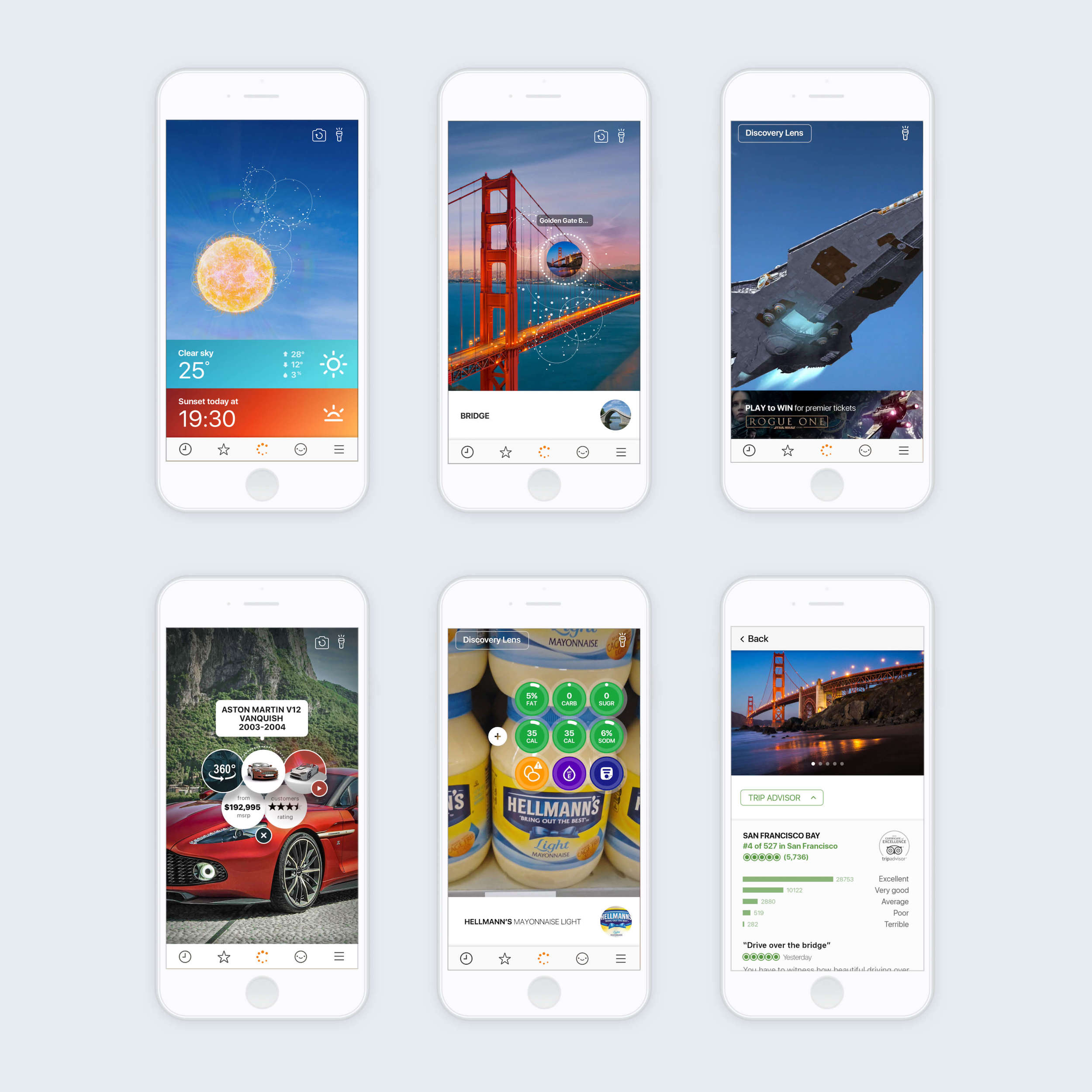
Cards
Our initial approach taken to embrace the lack of SLAM involved an object spawning from the camera and landing on the screen as a card. Then slide off into a column of cards, allowing a user to scan a few things then view info about them without having to keep holding their phone up. We felt this was an effective way of meeting constraints and working within our principles.
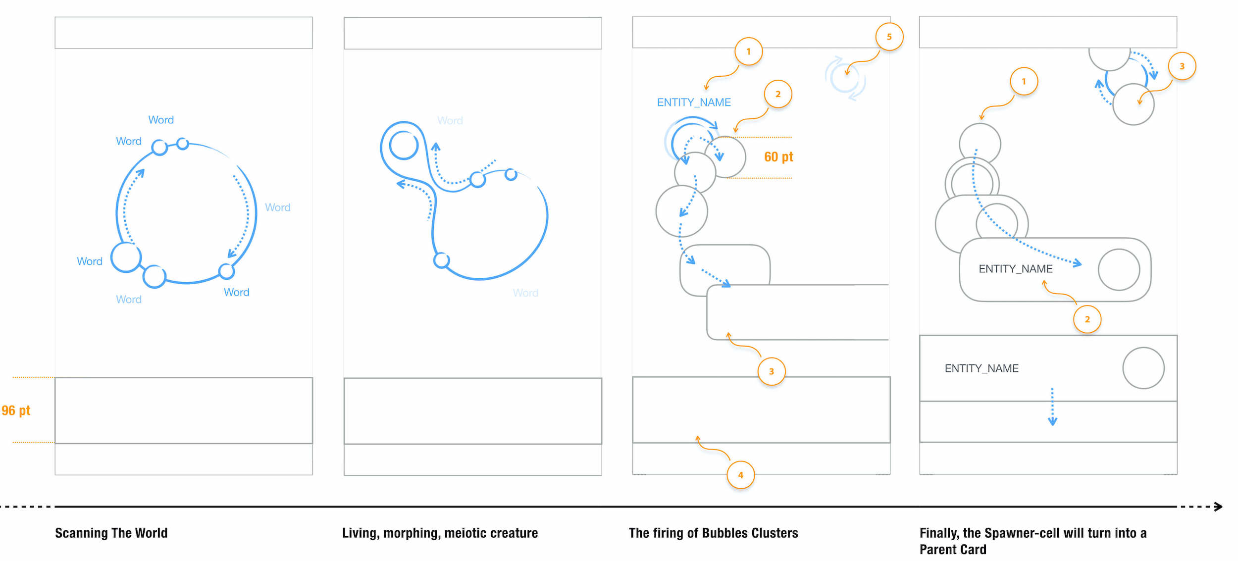
A huge amount of thinking was done through Motion prototypes. It encouraged us to consider details sooner, and communicate abstract concepts visually to our tech team and hear feedback.
I really learnt the value of taking the time to consider what you want to communicate, and picking the best tool for the job.
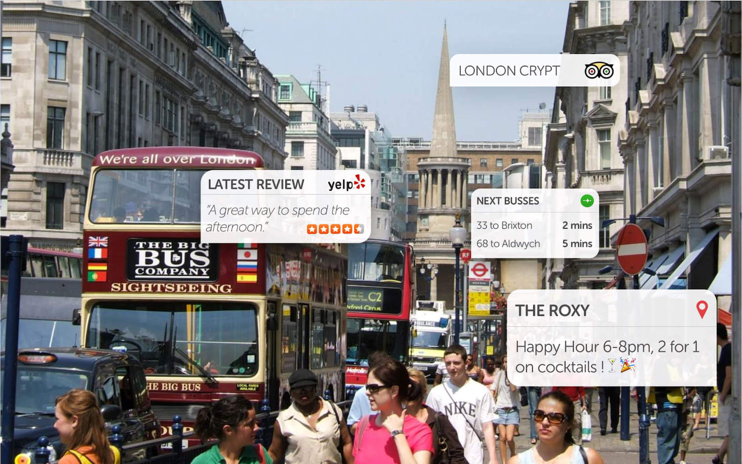
Considerate content
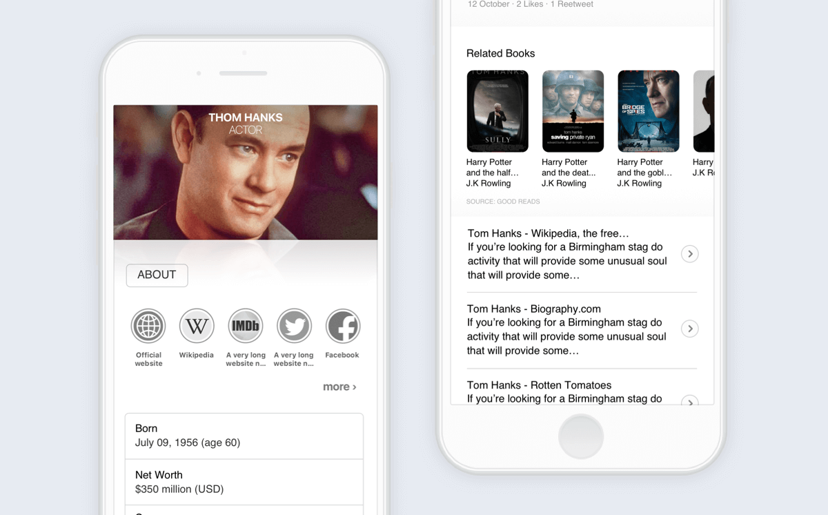
We worked closely with our content team to present information in a lightweight way, prioritising what was seen to be the most useful dependent on what was scanned.
Progressively displaying more information allowed for recognition errors and kept things light whilst allowing for further exploration.
Turns out, it was a lot of work to prioritise information for millions of objects without an understanding of context. Naturally, it was jam-packed with assumptions. So we ended up reverting to just saying what the thing was, then allowing a user to see all information we had about it in a separate page.
Launch 🚀
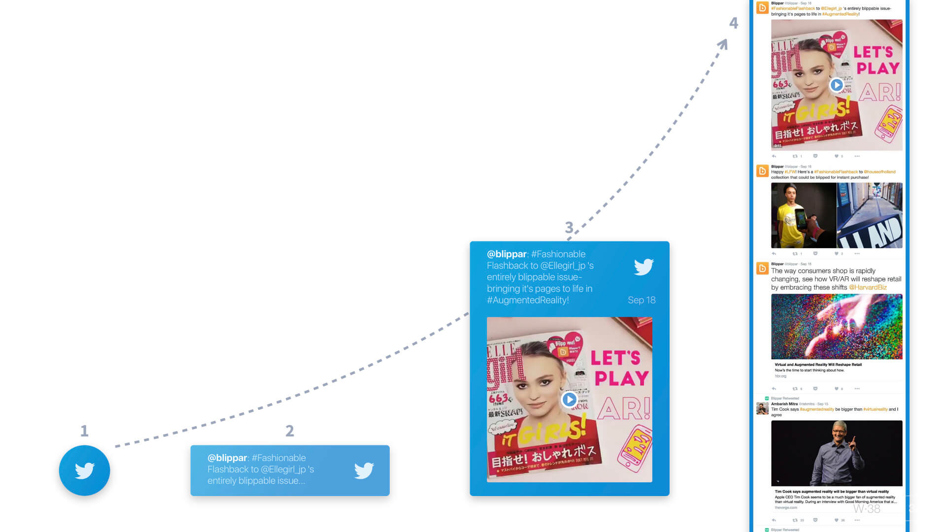
Once the product launched it got a huge amount of press and served as a great tech demo for the company. It helped the company close their biggest round of funding to date and served as a great platform for future product improvements, such as the introduction of Blippar Halos — an AR profile set up to be triggered with when your face is scanned.
- The app was a huge drain on battery life
- Cards flying towards the user were overwhelming
- Constant object recognition racked up server costs
- Recognising so many objects resulted in mixed results
- People weren't sure what to use it for
We were able to fix most of these over the following months. A big help was introducing a mechanism that meant the user had to intentionally scan something by holding down a button. Technical improvements also meant we were able to utilise the AR space for presenting information.
Blippar always seemed to favour quantity over quality, making the task of designing a good experience for the millions of things that it could recognise an almost impossible task. Over future iterations the team focussed on creating rich experiences for specific queries — such as cars, people, food and landmarks.
Looking back
The biggest challenge in this project was the sheer ambition of it. We were working on an emerging technology, figuring out what works and what doesn't as we went. With very little time for validation we were forced to log our assumptions and validate them later. As someone who wanted to do things 'by the book' this was a hard thing to adapt to.
I learnt the value of making things sooner. Going high fidelity in the right scenarios can be extremely helpful for communication. It encourages detailed thinking as a group earlier. In this project we jumped straight from whiteboard sketches into high-fidelity videos. This approach may not be right for every project but it really helped with this one.