Hyper Wayfinding App

Product Designer, UI Design, Product Vision
Hyper is a project developed by the talented team at Dent Reality. I help weigh in on product direction and assist in UI design from time to time.
2020
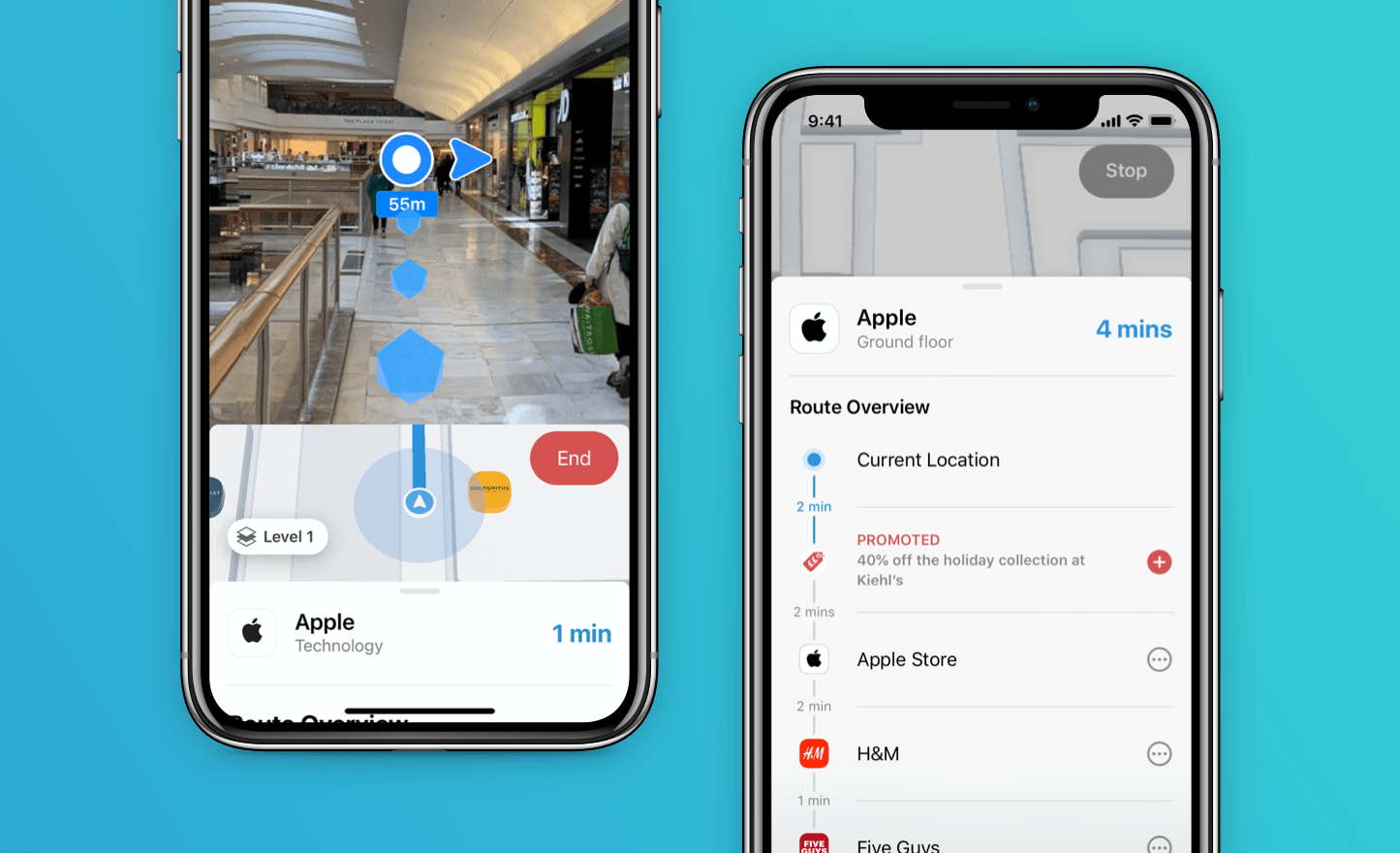
GPS is great for helping us get around the outside world, but it's not great indoors. Dent Reality have been working hard to solve this problem with their in-house technology — it's accurate to the meter...indoors! It's impressive stuff. Coupled with AR, their vision is to create hyper-personalised indoor spaces.
Their first stab at this is an app called Hyper. Built to test their technology and a potential market. It would help shoppers navigate indoor spaces and was already up and running at a London shopping mall.
I was initially ask to help polish up the design they had implemented, and make it "slick and easy to use" by working on the UX and UI. Although I was more than happy to help there, it didn't take long for me to realise that they needed a little product thinking...
Was their technology being used in a way that solved a problem that existed? This was where I felt I could add most value. Polishing up a few visuals along the way.
Getting started
As the app was already running in a shopping mall and the team had some targeted ads running on Facebook, it was getting light usage. The team were eagerly pouring over the data trying to work out why it wasn't already a runaway success guiding shoppers to their destinations left, right and centre.
They had noticed that people were searching but weren't completing journeys. Alongside a number of minor usability issues found through previous testing.
The goals were:
- Increase the number of users who complete a journey
- Improve usability of the Route Overview
- Introduce promotions to the app flow
- The big one - work out if this was a problem worth solving
Design improvements
I started off aiming to solve the few general design issues seen through testing. Getting more people starting a journey, improving usability and introducing areas for promotions.

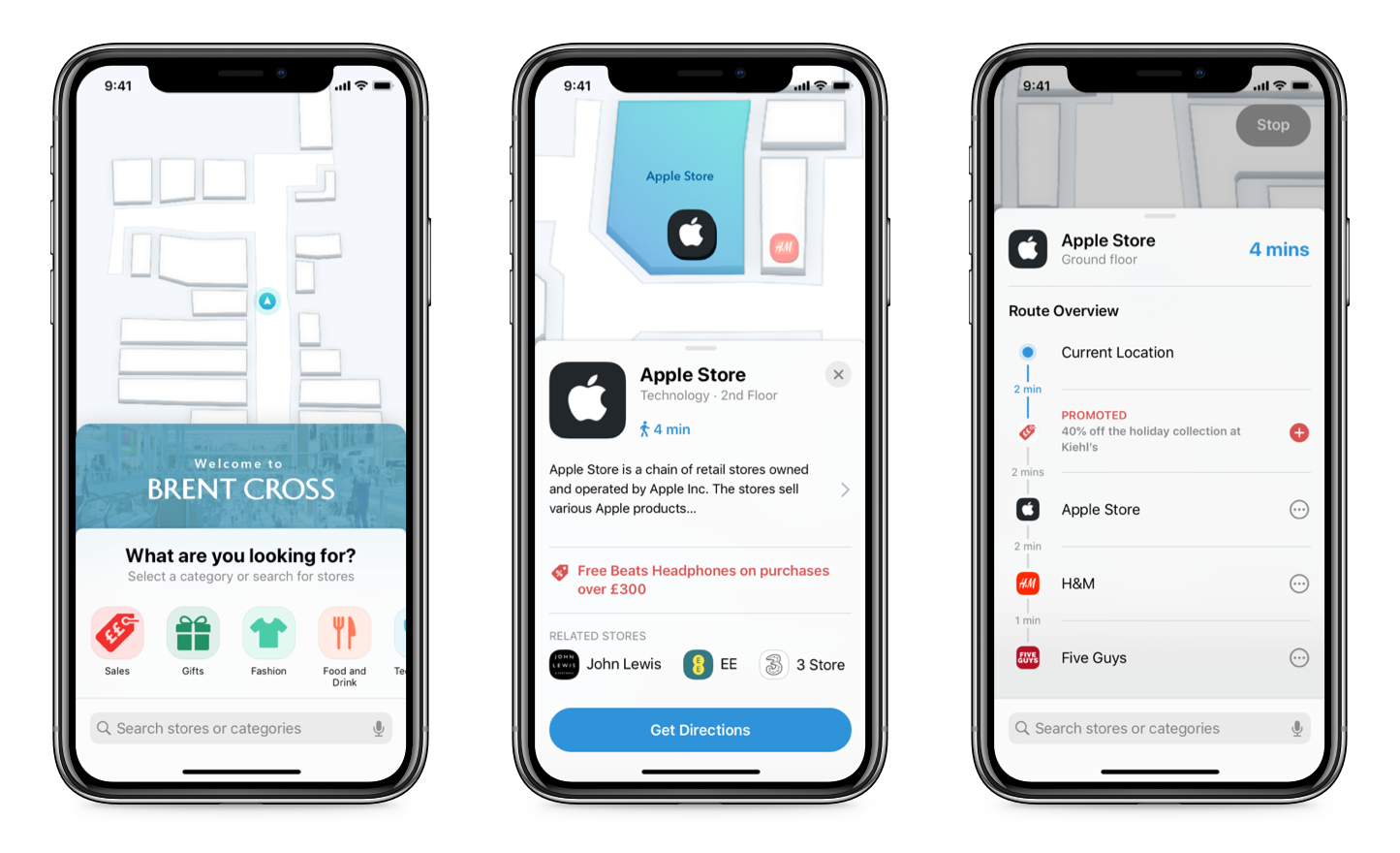
Previously after searching a store directions on the map were shown. Often people just used that and never initiated the journey. My assumption was that showing the store location and information, with a CTA to Get Directions would increase the number of users completing a journey in the app. This also created an opportunity to present store promotions.
The Route Overview page was redesigned to allow for easier adding and removing of stops, as well as surfacing promotions the were on-route.
Getting out of the building
We wanted to test the design changes as well as find out how whether our expectation of shoppers pains met reality.
"When I am shopping and not sure where a certain store is, I want to find the fastest route, So I can find what I’m looking to buy sooner."
Was this how shoppers were thinking? So over one weekend myself and the founder Andrew Hart made a list of all the product assumptions we'd made and took a trip to the shopping mall. Amazon vouchers in hand we'd get some answers.
Findings
Over 4 interviews and usability tests we managed to spot some patterns.
Ok so, the design improvements went down well. All shoppers started journeys with wayfinding which was a win. A few issues came up in the navigation so we were able to highlight those. We also managed to get shoppers passing most of the tasks we'd set, with a few minor issues to address.
But the most interesting thing findings were in the questions ahead of using the app. Turns out, people actually like going to the mall. It's a place to wander around, pick up a few things, hang out with friends. People go there regularly so actually know where things are. If they don't there's usually a map in sight. Yes, I'm sure there are people making a flying visit that need to get around as quickly as possible who need the most efficient route to each stop. But of those we spoke with, that pain wasn't really present.
In fact, this mall already has an app with a map. Not a particularly good one but it exists. Only one person we spoke with had downloaded it and that was driven by looking for a promotion.
What now?
So that leaves us with a product that doesn't really solve a huge problem. Well, at least we got there quickly and it didn't take the team too long to learn it. The Lean Startup in action!
Shortly after we ran this testing the team started exploring other avenues to pivot their technology towards. This was forced further by the impact of Covid. Even if Hyper had been a runaway success in malls, I'm not sure where that would leave us now.
The team are currently exploring a solution that fits around retail but more specifically large supermarkets. Here the hope is that with more products to find, people more likely wanting to spend as little time in the store, and integrating with the rising scan and go apps they will create a more personalised and guided end-to-end grocery store experience.
Initial response from retailers has been promising with store a large store trial on the horizon.
I still act as their honorary product sounding-board.
