Saberr Website
UI Design, Visual Design
Just me and our founder on this one. I owned the UI and UX, he was responsible for copy and implementation.
2017 - present
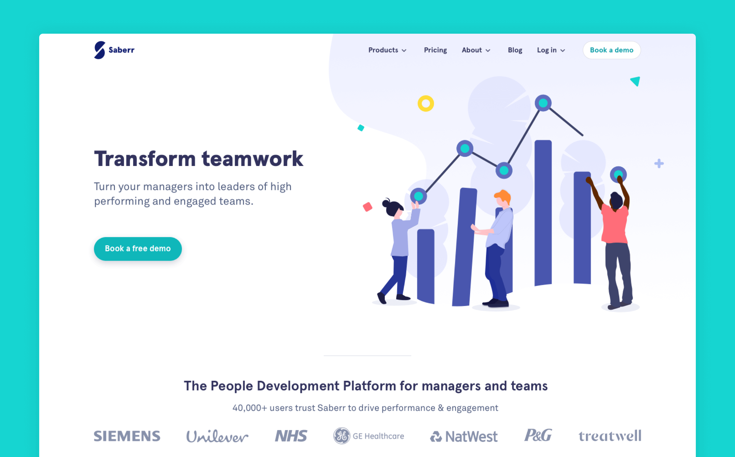
As our product evolved, our customers did. Our website needed to keep up and effectively showcase what we're all about.
Our goal was to better showcase who our products were for, how they worked, and their benefits. We hoped to increase the number of demo requests and the quality of those leads.
Content first
Our first step was to define a set of user stories for our content. We needed to ensure everything on the page was fit for the job. We trawled through all the feedback we had received up until now to help define a set of user stories stories for each page. From there we came up with the types of content that might be best suited to cater for each story.
Because Saberr has two products — Base and CoachBot — a unique challenge we faced was what role the homepage should take.
Thinking in blocks
As a small team, we wanted the site to be as modular as possible so that future iterations could be built from an existing set of blocks.
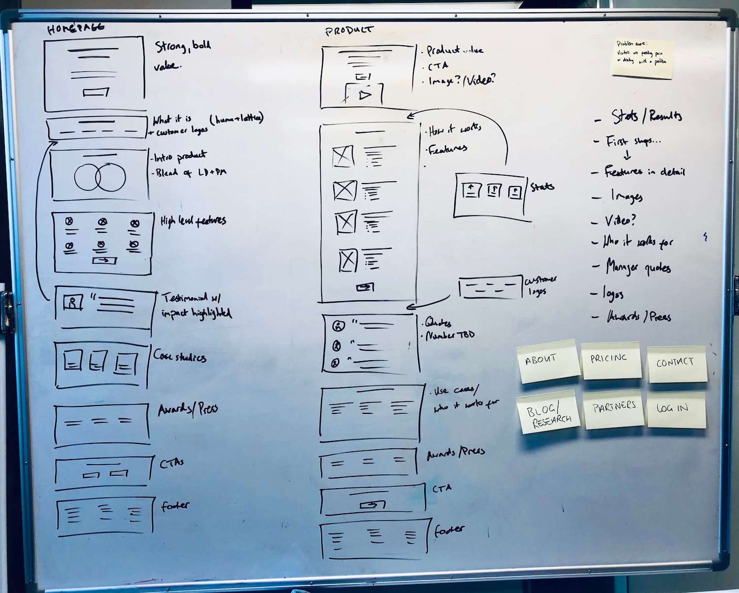
We created an outline for the structure of the site and the blocks we'd use on each page to support our message.
No lorem ipsum
Having an idea of layout already, wireframing was useful to encourage us to start thinking about the words on the page. It helped us quickly get a sense of the story we were telling and how across the whole site quickly and gather feedback.
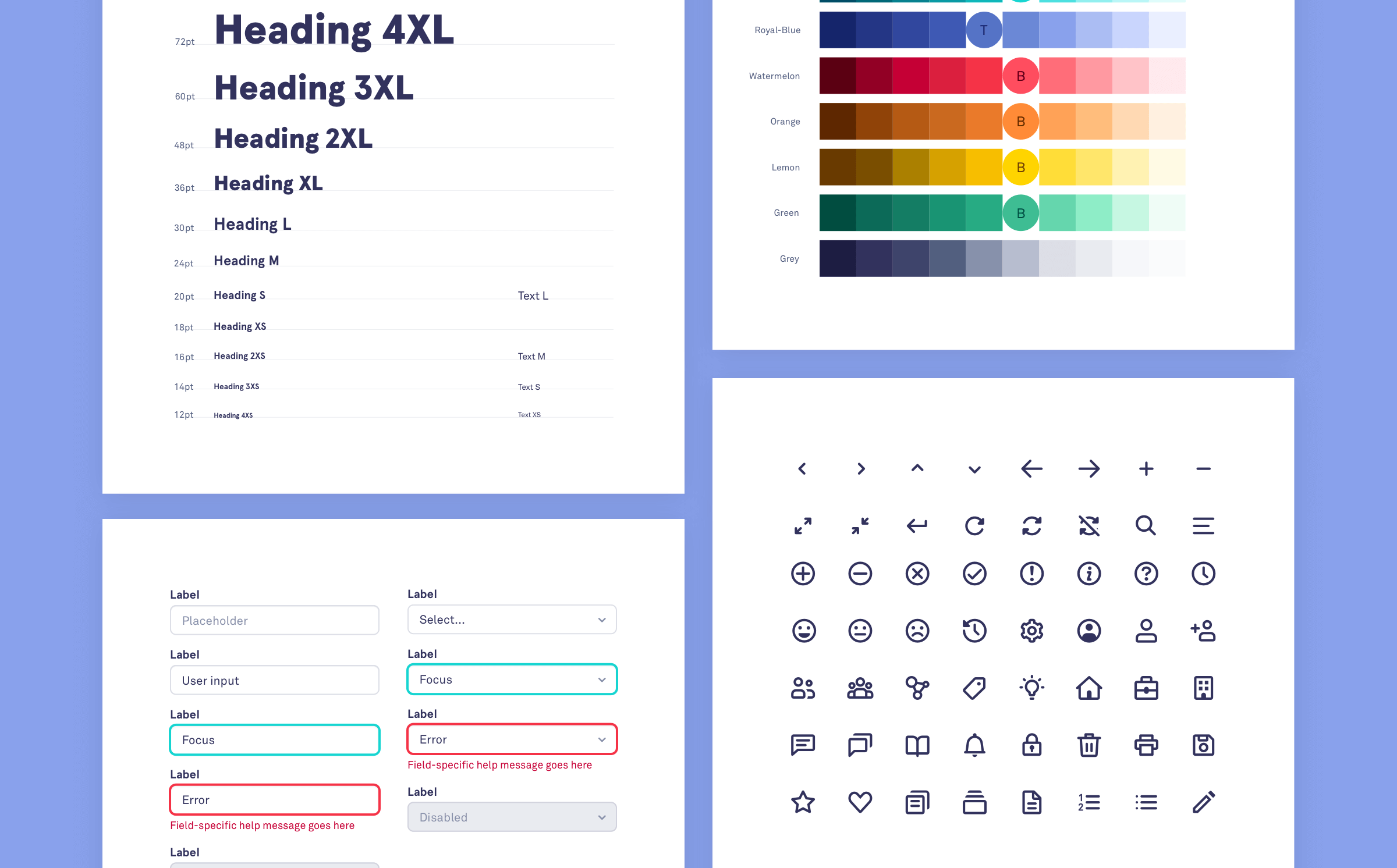
Visual design
We felt like the visual style of our site also needed an update. It felt a little heavy and didn't line up with B2B software.
We wanted to feel more:
- Trusted
- Insightful
- Positive
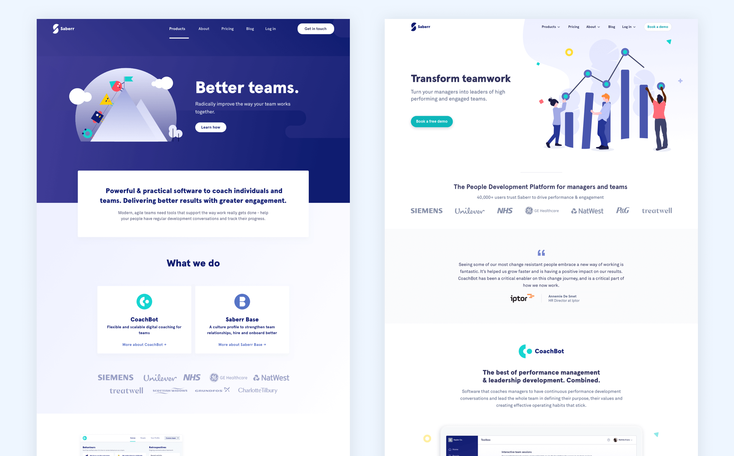
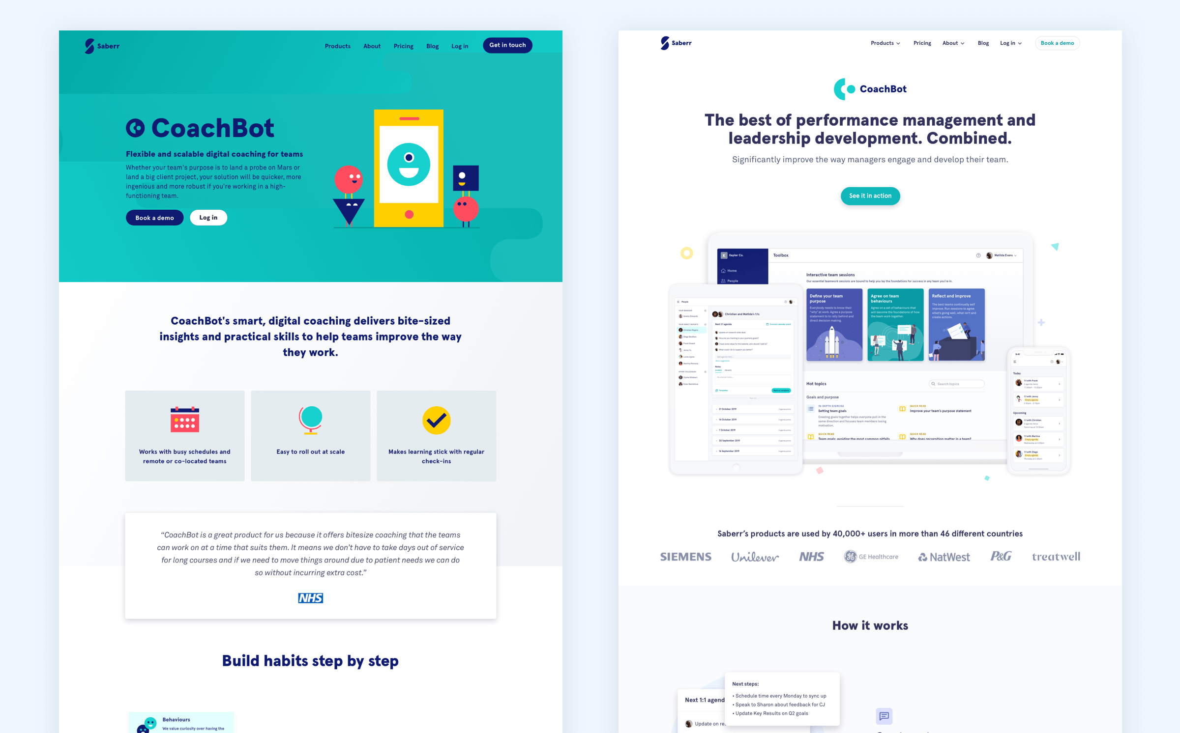
We retained the same overall tone by sticking with the same colour palette and typography, I took the opportunity to make the text slightly less chunky, use lighter colour variations and adjust our illustration style.
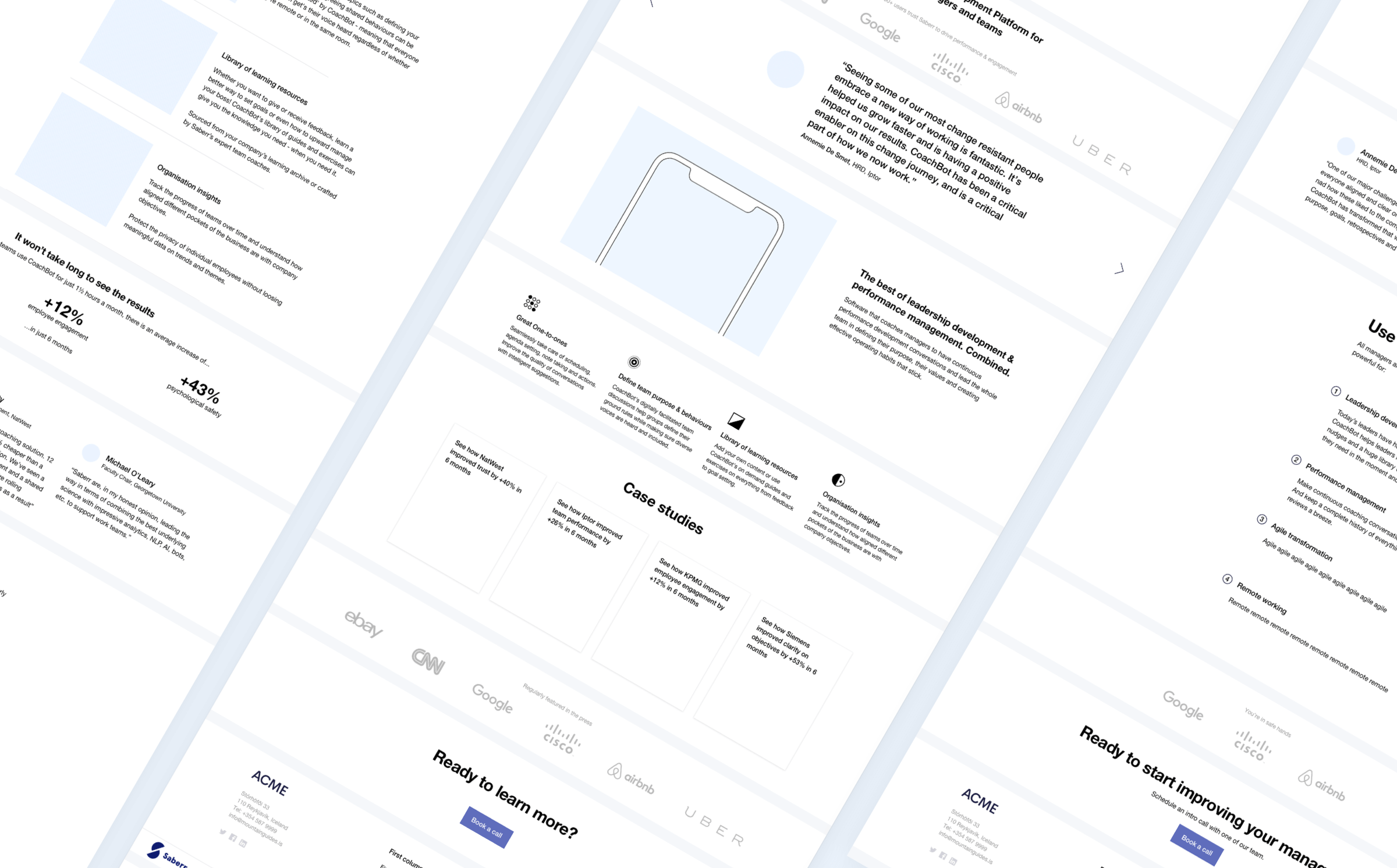
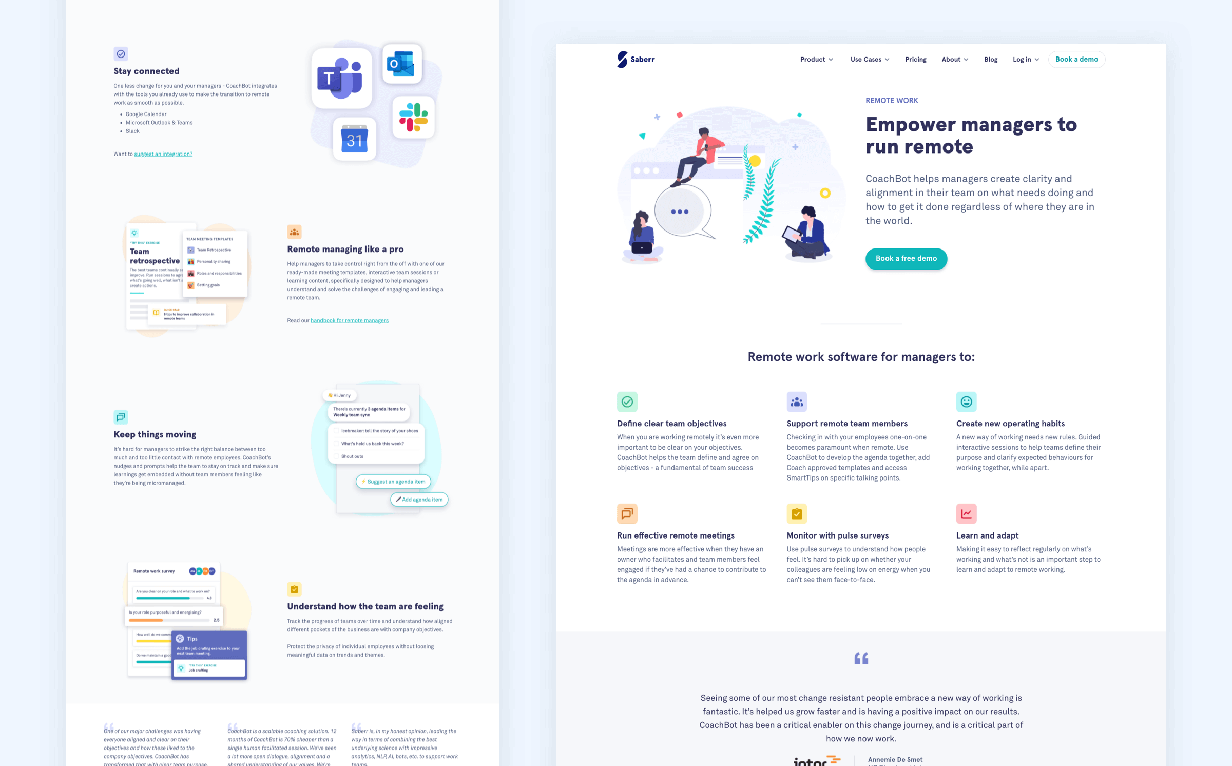
We learnt that there was still room to improve clarity over who could benefit from our product. Adding use case pages seemed to help.
The marketing team are continually improving how we reflect our value proposition on the site. Strategically, having to book a demo makes our offering more inline with enterprise clients. As we pivot our customer segment to smaller businesses we'd like to allow visitors to try the product without a demo.