Saberr Design System
UI Design
This one was a product team effort with myself owning the design and Figma components.
2018 - present
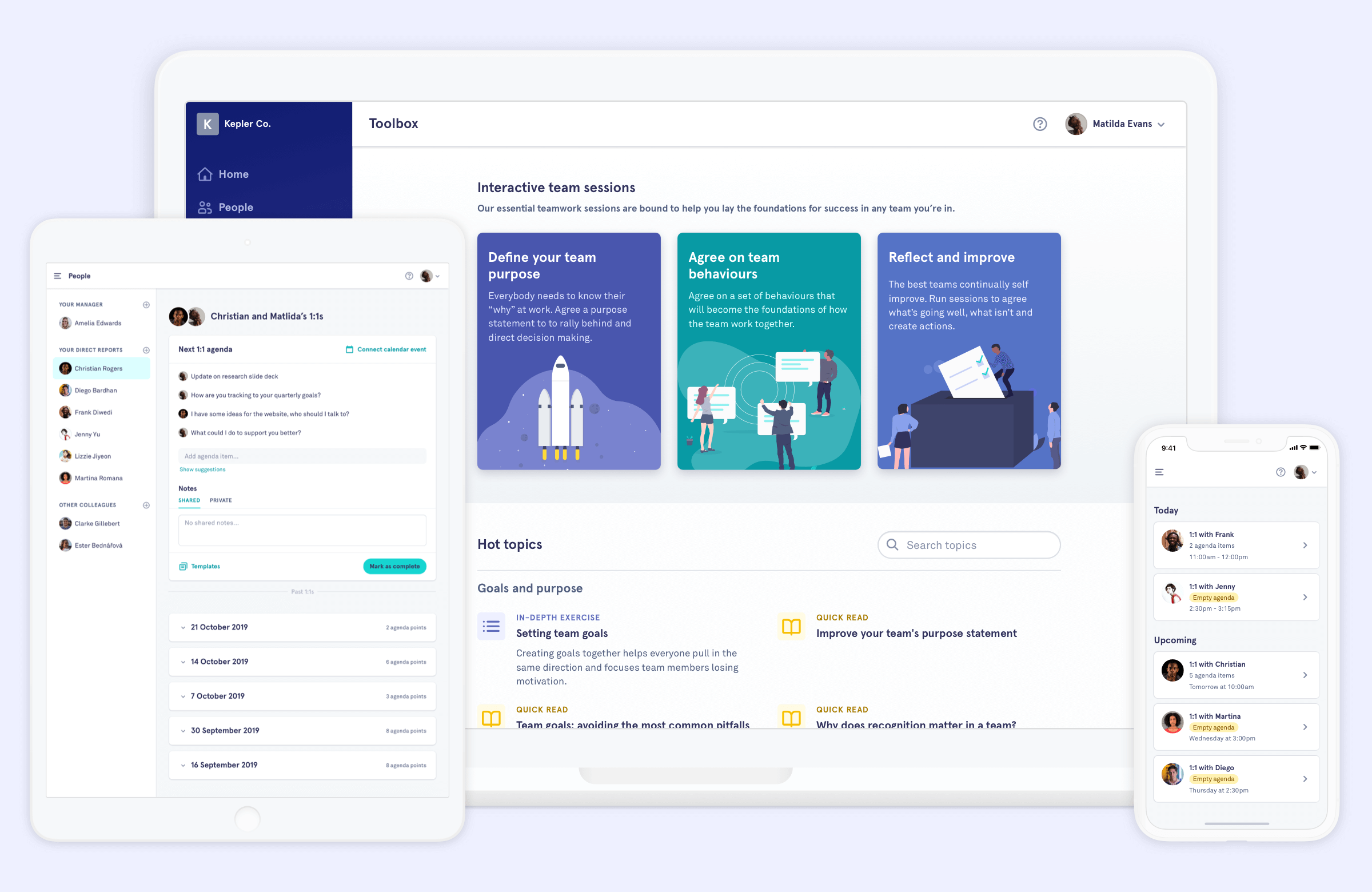
Working in an early stage startup is fast-paced. Rapidly experimenting with ideas and shipping product updates quickly. After a few years of no consistent branding, or guidelines, Saberr designs were inconsistent and builds were inefficient.
Our goal was to create a simple, flexible system that would help us work faster and create a more consistent experience.
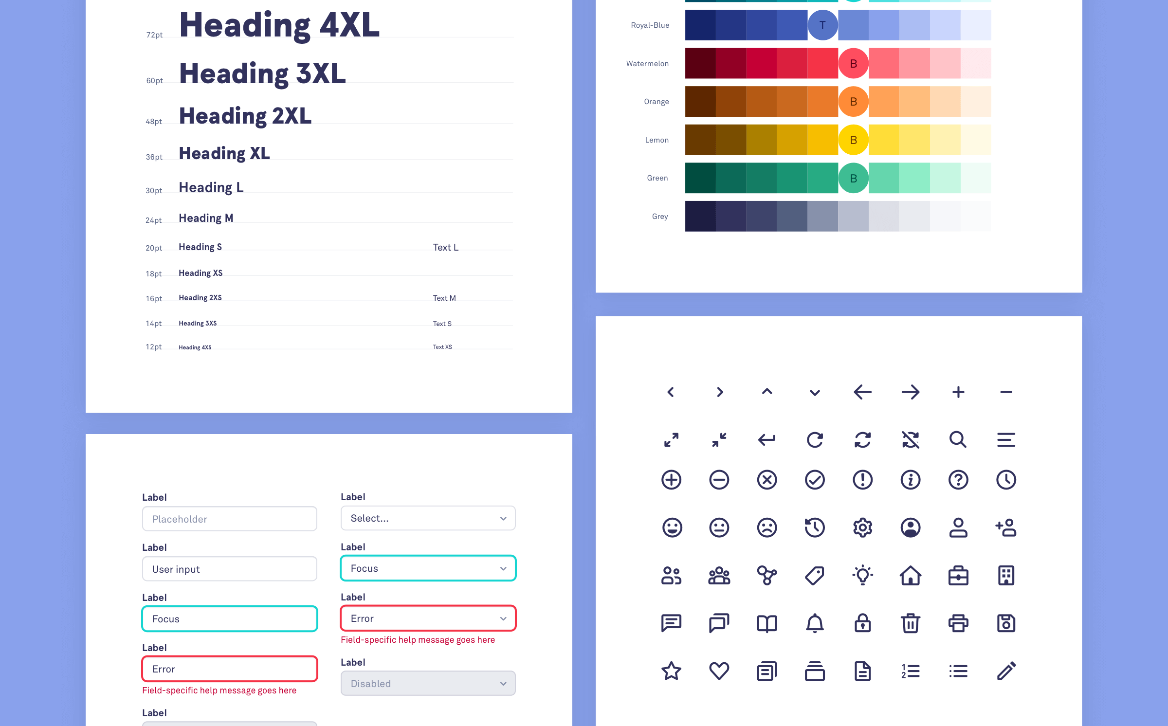
Taking stock
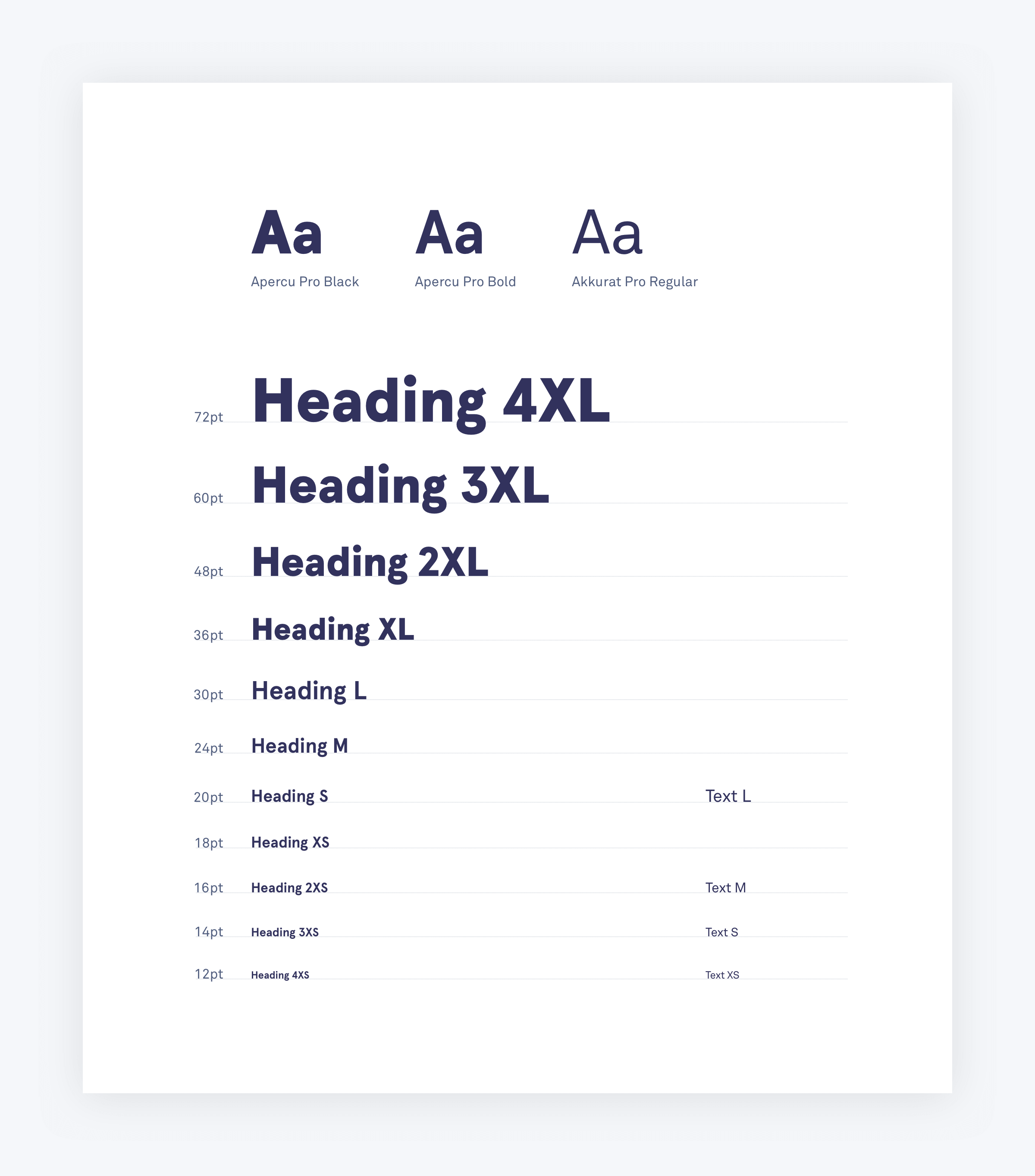
An interface audit allowed us to see the different variations we had of each element, helping us make components that would be fit for purpose.
Principles
We started off by outlining a set of guiding principles that would help us make our decision making process simpler.
Inclusive
Our products should work for everyone regardless of their ability, situation, or choice of device.
Simple
Aim to add as little load or complexity to our users lives, that includes ourselves.
Flexible
We have no idea what we might need to build in a years time. Our system is made up of a small set of well conceived building blocks rather than a large set of comprehensive ones.
Clear
It should be obvious to people how objects behave before interacting with them. We do the same for ourselves with good supporting documentation and constraints built in to our design system.
Consistent
We reuse our blocks as much as possible, making life easier for us and our users. When we encounter a snowflake we contribute it to the system so that it can be reused.
Familiar
Users spend most of their time on other sites. Use patterns that people are already familiar with, don't reinvent the wheel.
Iterative
We learn from real people and incorporate our findings into an ever improving system. Build a system that is easy to add to, refine and update.
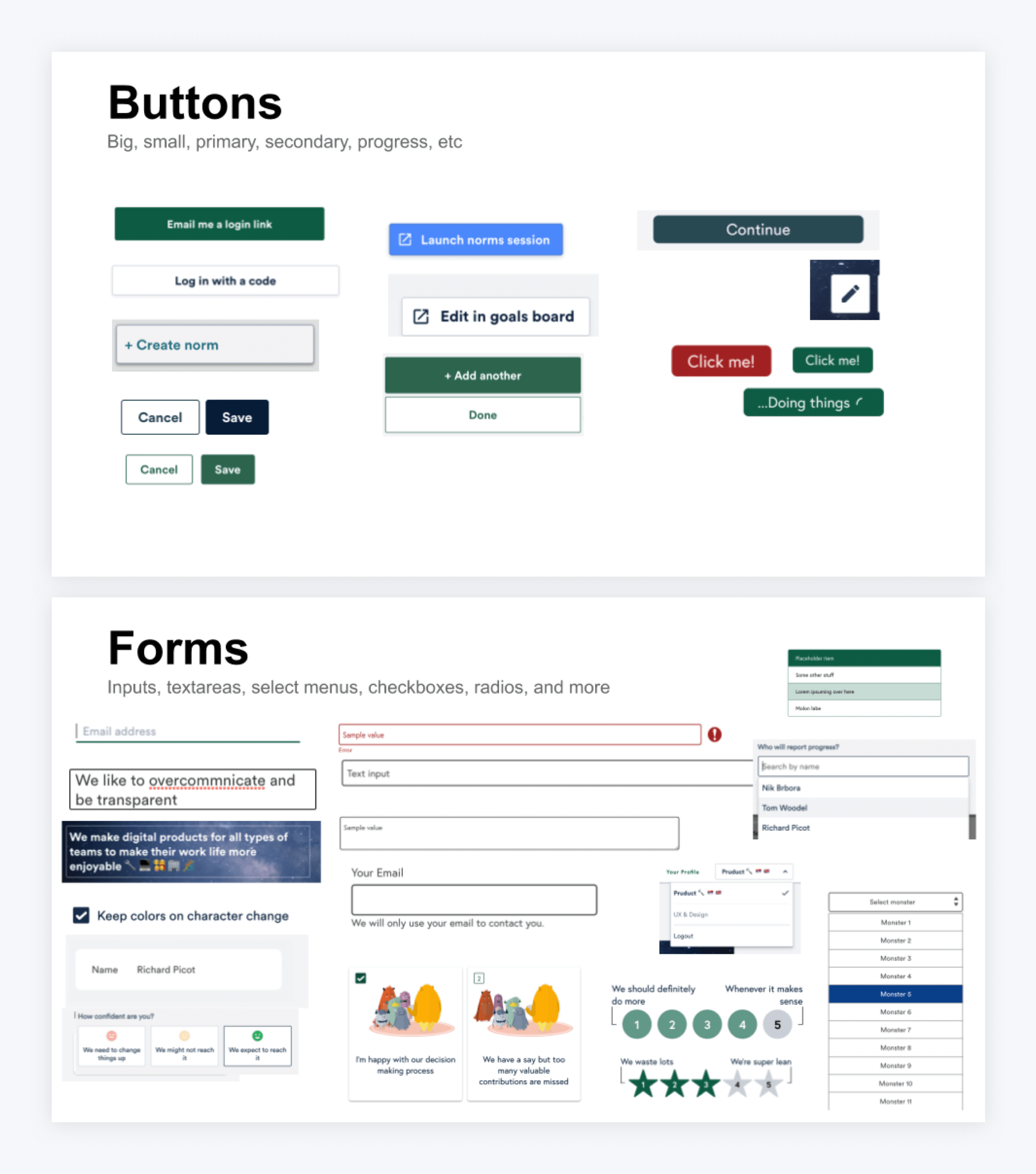
System
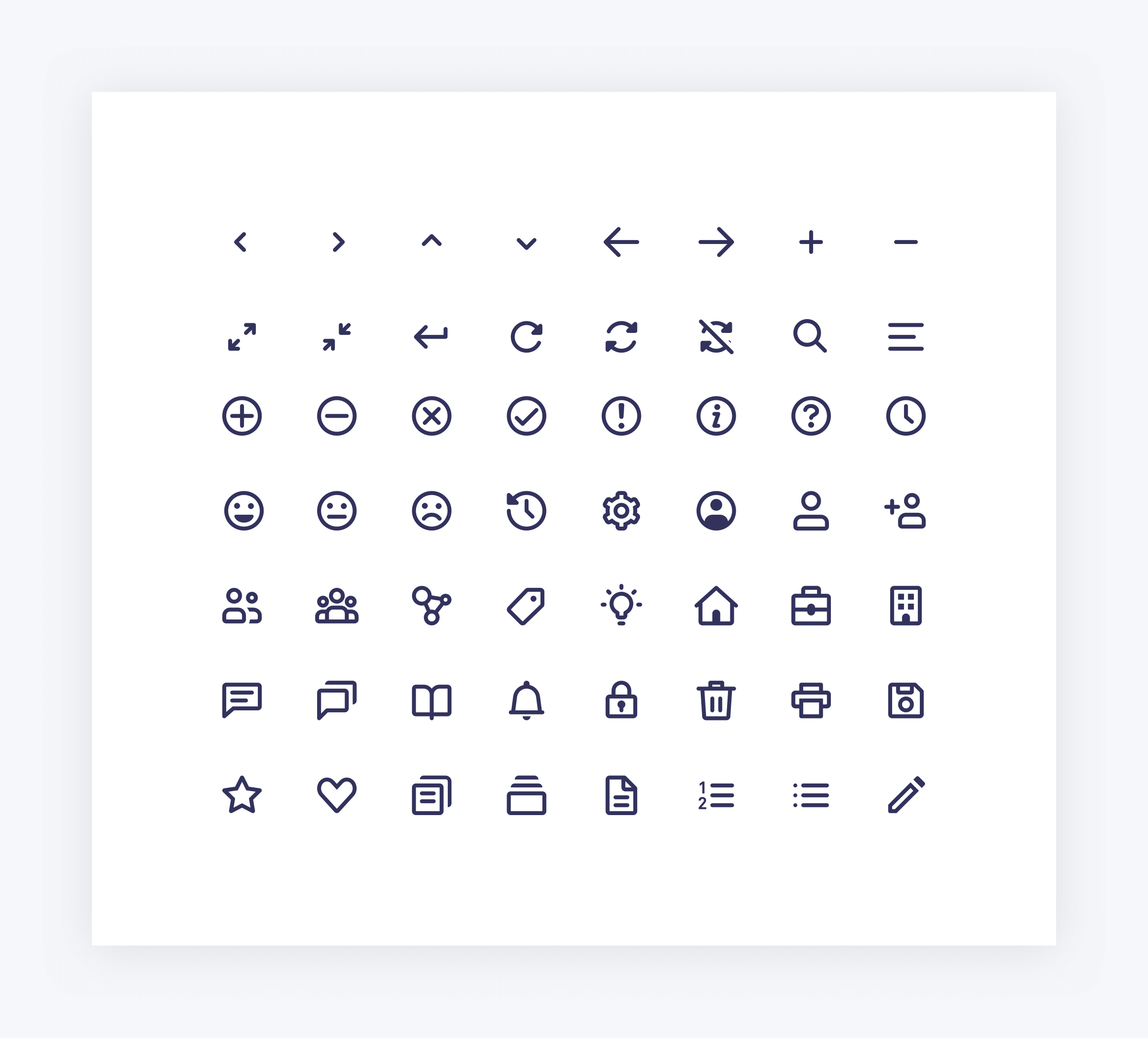

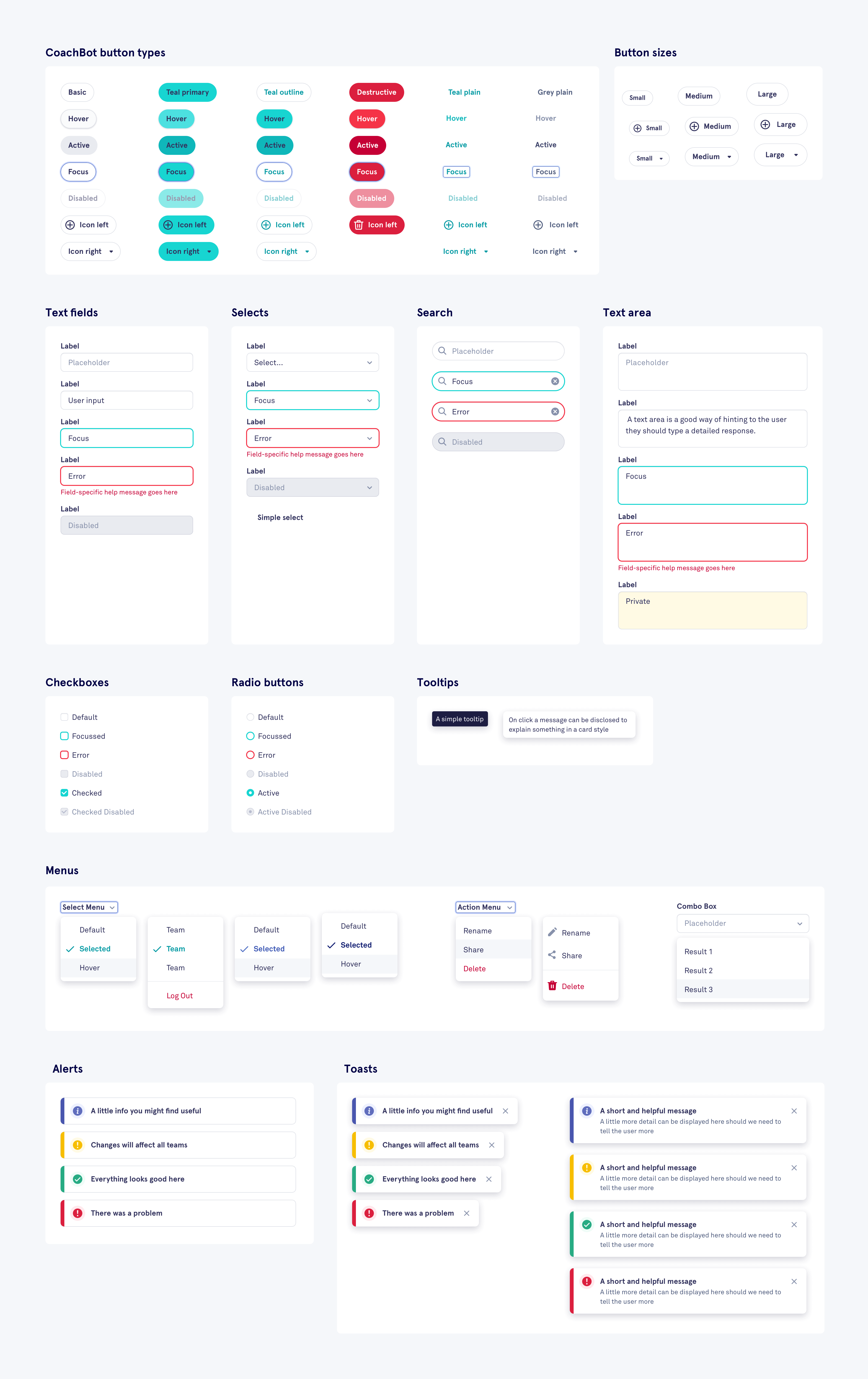
A design system is an ongoing project and can easily take a full-time developer and designer to maintain. Being a small team we made the decision to focus on the essentials, adding new components as we need them over time. Allowing us to avoid impacting our product roadmap. Although fairly simple, the system has proved extremely useful in removing ambiguity and helping us work faster.